branding
a consistent brand identity as a foundation for trust
Company: Capital Support


meet:
Capital Support
With a combination of financial expertise, independent advice and a personal way of working, Capital Support fulfils a strategic role for its clients. Discreet, professional and with an eye for calm and continuity.

the challenge
It was important not only to change the visual design, but to create a coherent brand story that carries through consistently in all forms of communication, from online to print. This builds trust and ensures a professional appearance towards clients and relations.
 Creating a look and feel that fits the expertise and maturity of the company
- Bringing consistency to materials used by the whole team
- Establishing a brand that radiates trust without becoming distant
- Modernising and developing both copy and imagery to match Capital Support's ambitions

Our brief was clear:
make the brand identity future-proof and ensure a consistent translation across all communications and materials.

our solution
- positioning & tone of voice
- sharpening the brand vision and core values
- a recognisable tone of voice
- the balance between formal, expert and personal
- visual identity
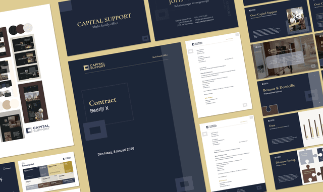
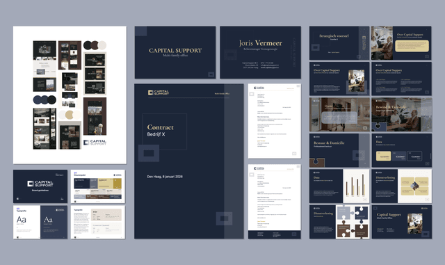
- a refreshed colour palette and typography system
- style elements that create recognition
- branding guidelines as a practical manual for consistent use
The corporate identity now visibly matches the level at which Capital Support operates.
- content and copywriting
- accessible language
- concrete value for the reader
- trust, transparency and calm
- SEO structure for better findability
We translated internal knowledge into understandable content for (potential) clients.
- templates and materials
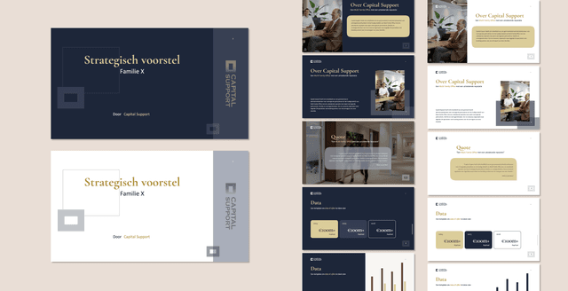
- PowerPoint templates and pitch decks
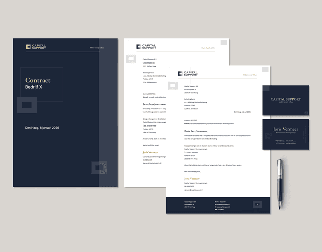
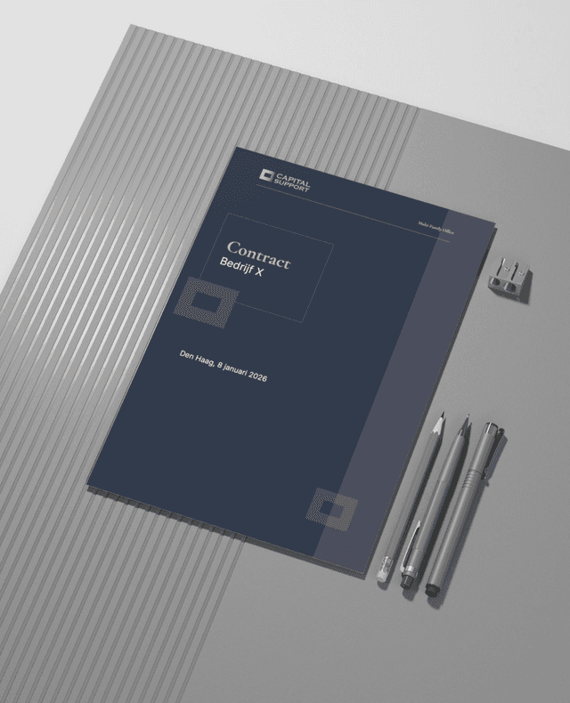
- Word letterhead
- Email signatures
- Social media visuals
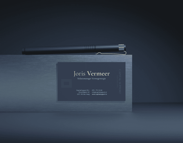
- Business cards
These materials ensure that Capital Support presents itself externally with a uniform look and feel. They are built to be user-friendly for the internal team, while also safeguarding brand consistency in every application.


the result
clear, recognisable
brand identity
professional look and feel that matches their role and ambitions
consistent visual and
textual story, online and
offline
set of practical materials that can be used widely within the team
what the client says
“Consistent and professional look and feel”
“After a previous collaboration, the contact was immediately good and engaged. Capital Support was looking for a partner who could help us professionalise and broaden further with a suitable new corporate identity, combined with new materials such as Teams backgrounds. In this process, it was important to have regular contact with each other and also to be able to explain the background to some of the choices. BE Digital was that partner for us and has really helped us with a consistent and professional look and feel that we aim to roll out fully in Q1 2026.”


the BE Digital Touch
Where many branding projects end at a logo or a document, Capital Support went home with an identity that works in language, in imagery and in application.
We work with, among others: